New Design Influences You and Your Classroom Observations
We’ve been planning ahead for Leveled Indicators for more than a year, and people have been asking for it for even longer.
So why did we go so slowly?
Capturing this type of data is tricky because we didn’t want to end up with an evaluation tool disguised as professional development.
A key reason why Edthena is loved by teachers is that it’s a safe place to ask for help, and we had to ensure this was still true if we offered this type of data collection.
While maybe it’s overkill to share these details, we feel it’s important to detail some of the choices we made as part of the process of designing and launching Leveled Indicators.
Where
Leveled Indicators is a feature of Explorations™. Explorations help bundle one or more pieces of evidence together into a learning cycle.
The decision to keep Leveled Indicators as part of Explorations was a purposeful one. Decidedly absent from our implementation is the ability to code videos with Leveled Indicators at specific moments in time.
Our thought is that a single moment within a lesson doesn’t help someone draw a conclusion about a teacher’s skill. It would be like leaving a Yelp review for a particular ingredient in a dish rather than the dish itself.
We kept the video conversation page focused on the skill of teacher noticing and the spirit of collaboration. So we added Leveled Indicators as part of the Exploration to act as a wrapper around the video (and other pieces of evidence).
Our hope is that this causes the coach to take a step back from the specific moments and think about the video holistically.
Context
The other big thing with how Leveled Indicators work is that they allow the coach to define the Target Level as part of the Exploration before teachers assemble their artifacts and before the coach leaves feedback.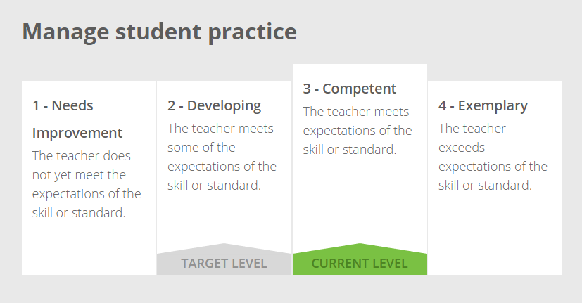
This is important because this clearly defines the expected level of skill from the teacher — a level which is often below the highest option.
Without explicit permission to be “not perfect,” it’s natural to want to be at the level perceived to be the best.
Becoming a great teacher is a process of developing skills across many years, and the tools we design should reflect that reality.
So if you’re just putting a new skill or strategy into practice, it makes sense that the expectation for professional proficiency may be something other than exemplary.
With Target Level and Current Level, it’s still safe to be not perfect.
Name
It would have been easy to call this set of features something like “ratings.” But the word carries too much connotation related to being judged.
The data that we capture is not a judgement of the teacher’s performance; it’s meant only as a reference point for what’s observable within the set of video evidence.
The word “leveled” is also used in other education contexts, such as reading diagnostic tests for elementary readers.
Our hope is that name “Leveled Indicators” creates a neutral way to refer to the feature.
Colors
 Many systems that store data about teacher performance don’t consider the impact of color. A commonly used color progression is a scale from red to green.
But each of us is already conditioned that red means things like “bad” and “stop.” It is a color used universally as a warning and an alert. Think only to traffic lights and stop signs.
By only using green, we’re not letting color communicate a negative value judgement about what’s been observed.
Shape
Like names and color, shapes can also convey a meaning. For example, a wedge shape would indicate that some levels were less valuable than others.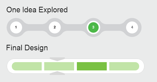
Or with the included example, the separation of the levels visually didn’t convey a connectedness between the levels.
Our final design was meant to display the different levels as a continuum. It’s not better or worse to be at one level, and (visually) it’s easy to move between levels as things change for the teacher.
Reports that actually add value
Without a way to analyze the data over time, Leveled Indicators would remain a tool that only helped teachers and coaches talk about “right now.”
Sure, we make the raw data available to coaches and teachers. But a CSV export requires more than a few steps to become a meaningful chart. Further, those charts would have to be manually updated over time.
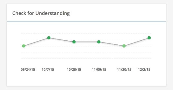 To make this process easier, we designed a set of automatic reports that helped coaches better support their teachers and helped teachers better track their progress.
For example, with just two clicks, a coach can see trends across the entire group of teachers for each of the skills being tracked.
By making the data easy to interpret for everyone, we believe that Leveled Indicators can meaningfully align the professional development pathway for an individual teacher with his or her actual needs.


